
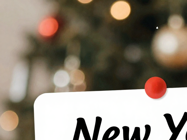
Viral New Year Gift Card Design Ideas for 2026
In This Article
Quick overview
Viral New Year Gift Card Design Ideas for 2026
New Year Gift Card Design Ideas for 2026: Viral Trends & Creative Techniques Introduction: Why 2026 New Year Cards Are Taking Social Media by Storm These New Year card designs are going viral for a reason—they’re breaking away from traditional red-and-gold schemes and embracing bold, contemporary aesthetics that resonate with modern audiences. As we approach […]
Why this matters
New Year Gift Card Design Ideas for 2026: Viral Trends & Creative Techniques
Introduction: Why 2026 New Year Cards Are Taking Social Media by Storm
These New Year card designs are going viral for a reason—they’re breaking away from traditional red-and-gold schemes and embracing bold, contemporary aesthetics that resonate with modern audiences. As we approach 2026, crafters and greeting card makers are facing an exciting challenge: creating festive greeting cards that stand out during the holiday season when everyone’s mailbox is flooded with well-wishes.
The difference between a card that gets displayed proudly and one that gets recycled comes down to thoughtful design choices. This guide will walk you through the trendy designs and color schemes for New Year 2026 that are capturing attention across Instagram, Pinterest, and craft communities worldwide.
2026 Color Trends for Greeting Cards

Digital Lavender and Cyber Lilac
The Pantone-influenced palette for 2026 leans heavily into soothing yet futuristic purples. Digital lavender paired with deep plum creates sophisticated depth while maintaining that celebratory feel. This combination works beautifully for:
– Modern minimalist designs
– Gradient backgrounds
– Watercolor washes with crisp white typography
Warm Terracotta and Sunset Orange
Moving away from cold winter blues, 2026 embraces warmth. Terracotta paired with peachy oranges and cream creates an inviting, optimistic vibe perfect for New Year messaging. These earth tones convey:
– Grounded optimism for the year ahead
– Warmth and personal connection
– Vintage-modern aesthetic appeal
Emerald Green and Gold Reimagined
While green and gold remain classics, 2026’s version features deeper, jewel-toned emeralds rather than bright Kelly greens. Pair with brushed gold (not shiny) for:
– Luxury without being ostentatious
– Nature-inspired elegance
– Perfect balance between traditional and contemporary
Monochromatic Metallics
All-silver, all-copper, or all-rose-gold schemes create stunning impact. The key is varying the finishes—combine matte, brushed, and reflective surfaces in the same metallic family for dimension without chaos.
Unexpected Combinations
Viral designs for 2026 feature surprising pairings:
– Sage green + dusty pink + bronze
– Navy blue + coral + cream
– Charcoal gray + champagne gold + blush
These sophisticated combinations appeal to design-conscious recipients and photograph beautifully for social sharing.
Typography and Lettering Ideas for New Year Messages
Bold Serif Statements
Chunky, high-contrast serif fonts are dominating 2026 design trends. Think editorial magazine mastheads applied to greeting cards. Use them for:
– “2026” as the primary focal point
– Single-word messages like “CHEERS” or “CELEBRATE”
– Creating dramatic hierarchy with smaller script fonts
Hand-Lettered Authenticity
Imperfect, genuine hand-lettering conveys warmth that printed fonts can’t match. Techniques gaining traction:
1. Brush Lettering: Use brush pens for flowing, connected script that feels personal and energetic.
2. Faux Calligraphy: Perfect for beginners—write in cursive, then add thickness to downstrokes for a calligraphic effect without special pens.
3. Mixed Case Playfulness: Alternating between upper and lowercase mid-word creates a casual, friendly vibe: “Happy NEW year” or “cheers TO 2026.”
Retro Revival Typography
1970s-inspired bubble letters and groovy fonts are making a comeback with modern twists:
– Use gradient fills instead of solid colors
– Add subtle shadows for dimension
– Pair with contemporary sans-serif body text for balance
Minimalist Sans-Serif Elegance
For sophisticated, gallery-worthy cards, ultra-clean sans-serif fonts in generous spacing create breathing room:
– ALL CAPS with extensive letter-spacing
– Generous white space around text
– Single-color designs that rely on typography alone
Typography Placement Trends
1. Vertical Text: Running your message vertically along the card’s edge creates visual interest and modern appeal.
2. Overlapping Layers: Place large, transparent text behind smaller, solid elements for depth.
3. Circular Arrangements: Wrapping text around a central element (like “2026” or a decorative motif) guides the eye and creates movement.
Message Personalization
Move beyond “Happy New Year” with messages that resonate:
– “Here’s to new beginnings”
– “Making 2026 unforgettable”
– “Cheers to fresh starts and bold moves”
– “New year, new adventures”
– “Let’s make this year count”
Adding Metallic and Glitter Elements Effectively

The Less-Is-More Metallic Rule
The biggest mistake in adding metallics is over-application. Viral designs use strategic placement:
1. Accent Only: Apply metallic elements to 20-30% of your design maximum. This creates focal points rather than overwhelming shine.
2. Deliberate Placement:
– Just the numerals “2026”
– Border edges only
– Single graphic element
– Select words in your message
Metallic Application Techniques
1. Foil Transfer Sheets: These create professional-looking metallic accents without mess. Apply with a laminator or iron for stunning results on:
– Printed card designs
– Stamped images
– Die-cut shapes
2. Metallic Gel Pens: Perfect for hand-drawn details and adding sparkle to specific areas. Use for:
– Outlining stamped images
– Adding stars or dots
– Highlighting portions of hand-lettering
3. Embossing Powder: Heat embossing creates raised, shiny elements with professional polish:
1. Stamp your design with embossing ink
2. Apply metallic embossing powder
3. Heat until melted and glossy
4. Let cool for dimensional shine
4. Metallic Cardstock: Using metallic paper as your base or as layered elements provides subtle shimmer without additional application.
Glitter: The Strategic Approach
Glitter can elevate or overwhelm. Here’s how to use it effectively:
1. Fine vs. Chunky:
– Fine glitter: Professional, subtle sparkle for large areas
– Chunky glitter: Bold statement pieces, use sparingly as accents
Application Methods:
Glitter Cardstock: Pre-glittered paper eliminates mess while providing even coverage. Perfect for die-cut shapes or layered elements.
Adhesive Sheets: Double-sided adhesive cut into precise shapes ensures glitter only goes where you want it.
Glitter Glue Pens: Controlled application for details, dots, and line work without loose glitter chaos.
Combining Metallics and Glitter
The most viral designs thoughtfully combine different types of shine:
1. Texture Contrast: Pair smooth metallic foil with textured glitter for visual interest.
2. Temperature Mixing: Combine warm metallics (gold, copper, rose gold) with cool glitter (silver, holographic) for sophisticated contrast.
3. Matte + Shine Balance: Use matte cardstock as your base to make metallic and glitter elements pop dramatically.
Protecting Your Sparkly Elements
Nothing ruins a beautiful card like glitter falling off in the envelope:
– Seal glitter with clear acrylic spray or brush-on sealer
– Use vellum envelopes to showcase shimmer while protecting contents
– Add “contains glitter” stickers to envelope exteriors as courteous warning
– Consider acetate overlays for maximum sparkle protection
Alternative Shine Options
For those wanting sparkle without mess:
1. Holographic Elements: Self-adhesive holographic paper or stickers provide rainbow shine with zero shedding.
2. Pearlescent Finishes: Subtle shimmer that photographs beautifully without loose particles.
3. Metallic Washi Tape: Quick borders and accents with perfect edges and no drying time.
Pro Tips for Creating Share-Worthy New Year Cards
Design for the Camera
Since viral cards get photographed and shared:
– Use high-contrast elements that photograph well
– Avoid muddy mid-tones that disappear in photos
– Create dimensional elements that cast interesting shadows
– Consider how your design looks both flat and standing up
Incorporate Interactive Elements
1. Pull-Tab Reveals: Hidden messages that reveal when a tab is pulled create surprise and delight.
2. Shaker Cards: Sequins or confetti moving behind acetate windows add playful movement.
3. Pop-Up Elements: Three-dimensional surprises when the card opens boost wow-factor.
Size and Shape Innovation
Standard rectangles work, but viral designs often feature:
– Tall, narrow formats (4″ × 9″)
– Square cards (6″ × 6″)
– Die-cut shapes (circles, hexagons, champagne bottles)
– Folded shapes beyond the traditional bi-fold
Mixed Media Magic
Combining techniques creates unique results:
– Watercolor backgrounds + digital printing
– Hand-lettering + printed elements
– Fabric or ribbon accents on paper bases
– Wood veneer combined with traditional cardstock
Sustainability Angle
Eco-conscious designs are trending:
– Recycled cardstock with visible flecks
– Plantable seed paper
– Natural, biodegradable glitter alternatives
– Reusable elements (cards that become ornaments or bookmarks)
Theme Series
Instead of one-off designs, create coordinated sets:
– Vintage glamour collection
– Modern minimalist series
– Nature-inspired suite
– Art deco revival collection
Series encourage social sharing as people collect and display complete sets.
Conclusion: Making Your 2026 Designs Unforgettable
Creating New Year cards that stand out in 2026 comes down to balancing current trends with timeless techniques. The viral designs we’re seeing share common elements: sophisticated color palettes that move beyond expected holiday schemes, typography that makes a statement without sacrificing readability, and strategic use of metallics and glitter that adds sparkle without overwhelming the design.
Remember that the most shared cards tell a story and create an emotional connection. Whether you choose bold, playful bubble letters or elegant serif statements, ensure your design reflects genuine celebration and optimism for the year ahead.
The beauty of handmade greeting cards lies in their imperfections and personal touches. Don’t be afraid to experiment with the techniques outlined here, mixing and matching until you find combinations that feel authentically you. Your unique voice, combined with 2026’s trending aesthetics, will create cards recipients treasure long after the champagne bubbles have faded.
Start with one technique—perhaps the digital lavender palette or brush lettering—and build your skills from there. The crafting community loves seeing creative processes, so document your journey and share your experiments. You might just create the next viral New Year card design.
Here’s to making 2026 unforgettable, one beautiful card at a time.
Frequently Asked Questions
Q1: What are the most popular color schemes for New Year cards in 2026?
A: The trending color palettes for 2026 include digital lavender paired with deep plum, warm terracotta with sunset orange, reimagined emerald green with brushed gold, and monochromatic metallic schemes. Unexpected combinations like sage green + dusty pink + bronze or navy blue + coral + cream are also going viral for their sophisticated appeal.
Q2: How can I add glitter to cards without making a mess?
A: Use controlled application methods like pre-glittered cardstock, double-sided adhesive sheets cut into precise shapes, or glitter glue pens for detailed work. Always seal glitter with clear acrylic spray or brush-on sealer to prevent shedding, and consider using vellum envelopes or acetate overlays for protection during mailing.
Q3: What typography styles work best for New Year greeting cards?
A: Bold serif fonts create dramatic statements, hand-lettered brush calligraphy adds authentic warmth, retro 1970s bubble letters with modern gradient fills offer playful energy, and minimalist sans-serif with generous spacing provides sophisticated elegance. Mixing styles—like pairing chunky serifs with delicate script—creates a compelling visual hierarchy.
Q4: How much metallic accent is too much on a greeting card?
A: Follow the 20-30% rule: metallic elements should cover no more than one-third of your design. Strategic placement on just the numerals ‘2026,’ border edges, or select words creates elegant focal points, while over-application can overwhelm the design and make it look gaudy rather than sophisticated.
Q5: What makes a New Year card design go viral on social media?
A: Viral cards typically feature high-contrast elements that photograph well, dimensional components that create interesting shadows, interactive elements like pull-tabs or shaker windows, and innovative formats beyond standard rectangles. Designs that balance current trends with personal authenticity and tell an emotional story tend to get shared most frequently.
Q6: Are there eco-friendly alternatives to traditional glitter for cards?
A: Yes! Sustainable sparkle options include biodegradable plant-based glitter, holographic elements that don’t shed, pearlescent finishes, recycled cardstock with natural texture, and plantable seed paper. These alternatives provide visual interest while appealing to environmentally conscious crafters and recipients.
Q7: What card sizes and shapes are trending for 2026?
A: While standard 5×7″ cards remain popular, trending formats include tall narrow designs (4×9″), square cards (6×6″), and die-cut shapes like circles, hexagons, or themed silhouettes. Non-traditional folds and three-dimensional pop-up elements are also gaining traction for their wow-factor.
Q8: How can beginners create professional-looking hand-lettering?
A: Start with faux calligraphy: write your message in regular cursive, then add thickness to all downward strokes to create a calligraphic effect without special tools. Practice brush lettering with inexpensive brush pens, use pencil guidelines for consistent sizing, and remember that slight imperfections add authentic charm rather than detract from the design.